Academic Coffee Packaging
Academic Coffee Packaging
📦
Packaging Design
🏷️
Label Design
🎨
Palette Expansion
🔣
Iconography
🔤
Typography
PACKAGING DESIGN
LABEL DESIGN
PALLETTE EXPANSION
ICONOGRAPHY
TYPOGRAPHY
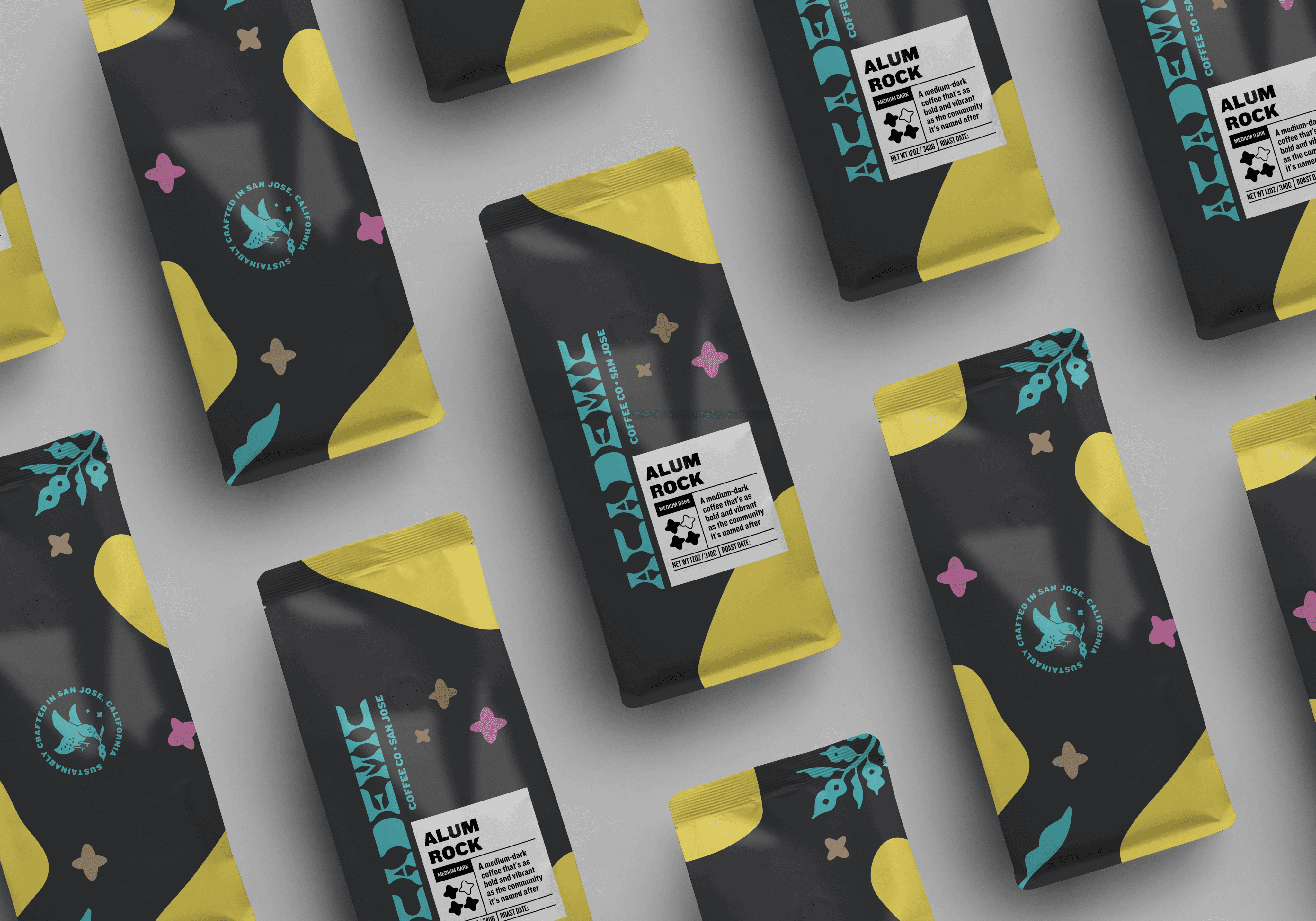
Inheriting the brand and visual design work from our previous Creative Director, my aim was to push the Academic Coffee's packaging toward a transformative redesign. Academic Coffee’s original coffee packaging reflected the cafe’s inviting atmosphere. My new design reflected the brand's vibrant character and catered to its growing partnerships with tech giants like Amazon and Intuit.
Inheriting the brand and visual design work from our previous Creative Director, my aim was to push the Academic Coffee's packaging toward a transformative redesign. Academic Coffee’s original coffee packaging reflected the cafe’s inviting atmosphere. My new design reflected the brand's vibrant character and catered to its growing partnerships with tech giants like Amazon and Intuit.
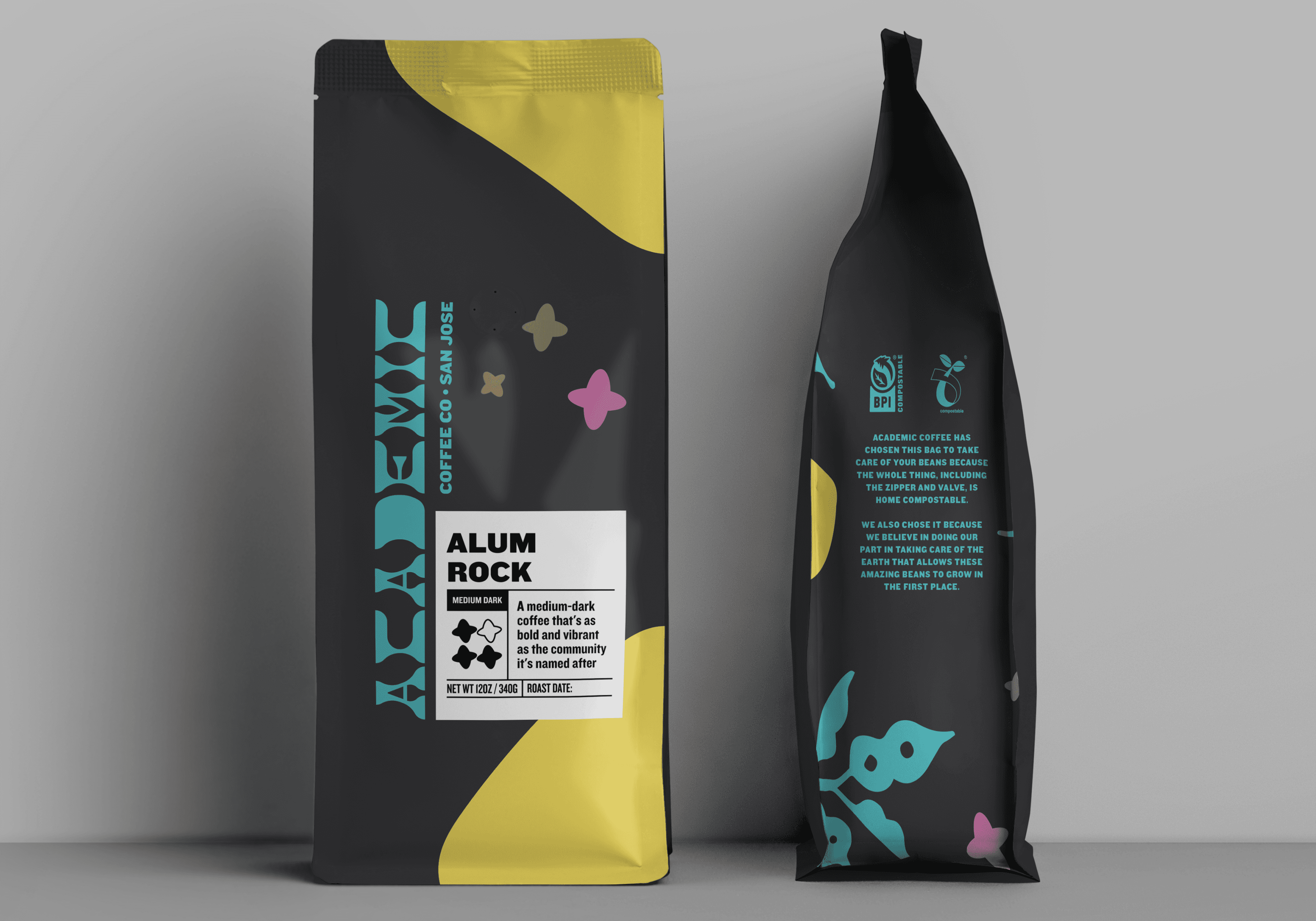
Our coffee bag labels are designed and placed with special care. While the bags themselves are mass-produced, the labels describing each roast change frequently. This approach reflects the cafe's commitment to optimizing each unique batch, accentuating subtle flavor characteristics. The label design guides customers' eyes sequentially: first to the roast name, then the roast level, followed by flavor notes, and finally the roast date.
Our coffee bag labels are designed and placed with special care. While the bags themselves are mass-produced, the labels describing each roast change frequently. This approach reflects the cafe's commitment to optimizing each unique batch, accentuating subtle flavor characteristics. The label design guides customers' eyes sequentially: first to the roast name, then the roast level, followed by flavor notes, and finally the roast date.
As a nod to the brand’s use of rounded stars that serve as bursts of joy and the delight that Academic’s coffee brings to the consumer, I carried them into the label as a visual indicator of the roast level; 1 star representing our lightest roast, 2 stars for our medium roast, 3 stars (shown here) for our medium-dark roast, and 4 stars for our darkest roast.
As a nod to the brand’s use of rounded stars that serve as bursts of joy and the delight that Academic’s coffee brings to the consumer, I carried them into the label as a visual indicator of the roast level; 1 star representing our lightest roast, 2 stars for our medium roast, 3 stars (shown here) for our medium-dark roast, and 4 stars for our darkest roast.
Knockout: A Functional Type Family Beyond Modernism
For the coffee label designs, I selected Knockout as the primary typeface. This choice was driven by the unique challenges of our labeling system: while the physical dimensions of our labels remain constant, the content—including titles and descriptions—changes frequently with each new roast.
Knockout's extensive family, with its nine widths and four weights, provides the flexibility needed to accommodate varying lengths of text within the fixed label space. This versatility allows me to maintain visual consistency across all products while adapting to the specific requirements of each coffee blend. By leveraging Knockout's range, I can ensure that every label, regardless of its content, remains legible, visually appealing, and true to our brand aesthetic.

The overall packaging design creates a visual hierarchy optimized for retail shelving. Recognizing that cafes might fold bag tops to fit various displays, I strategically placed the wordmark and label lower on the bag. This ensures key brand elements remain visible, regardless of how the bag is presented.
The overall packaging design creates a visual hierarchy optimized for retail shelving. Recognizing that cafes might fold bag tops to fit various displays, I strategically placed the wordmark and label lower on the bag. This ensures key brand elements remain visible, regardless of how the bag is presented.
Scroll to Top
Scroll to Top